Sun Oct 26, 2008
Wired magazine has some interesting pieces this month. Well, every month is pretty good, but writers might appreciate this behind-the-scenes look at how an article is assigned, written, edited, and designed. You can read the email correspondence between author and editor, and get an idea of how to pitch your story idea to a magazine. Great stuff.

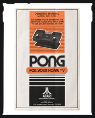
Also, technical writers might get a kick out of this photo essay of classic instruction manuals. What I found interesting was what Dan Winters, the photographer who compiled these, had to say: “I actually think that modern manuals are unreadable,” Winters says. “Visually speaking, they probably peaked in the ‘30s.” What rot. Seriously - is this guy part of the MTV generation or something? End-user documentation has never been cleaner and easier to understand. In fact, most help is migrating to interactive web-based apps that even a child would coo at. I understand he’s speaking as a visually-biased photographer - not a writer, but the overly intricate diagrams in his photo essay (as cool as they are in a retro sort of way) hardly represent the peak of information architecture.